
Due to the advent of smartphones and tablets, the percentage of mobile internet use is rising explosively. The tablets and mobile phones are gradually becoming the home device for using the internet. Sales of desktop PCs are falling. The displays of smartphones and tablets are smaller and have a lower resolution and the browser works slightly differently than on a normal PC. The conventional websites are therefore not displayed properly and the visitor has to swipe back and forth and zoom in to be able to read and operate your website, if this is possible .
The solution for this is a responsive website. The technology behind the website ensures that the site automatically adapts to the width of the visitor's screen. With smartphones, the site collapses, as it were, the images are reduced, but the text remains legible. The visitor now sees your website in a pleasant way with legible text and simple operation. In addition, all scripts and functionalities that can disrupt mobile display are deactivated, and the images are displayed in an optimized manner to limit data traffic to a minimum.
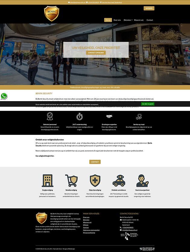
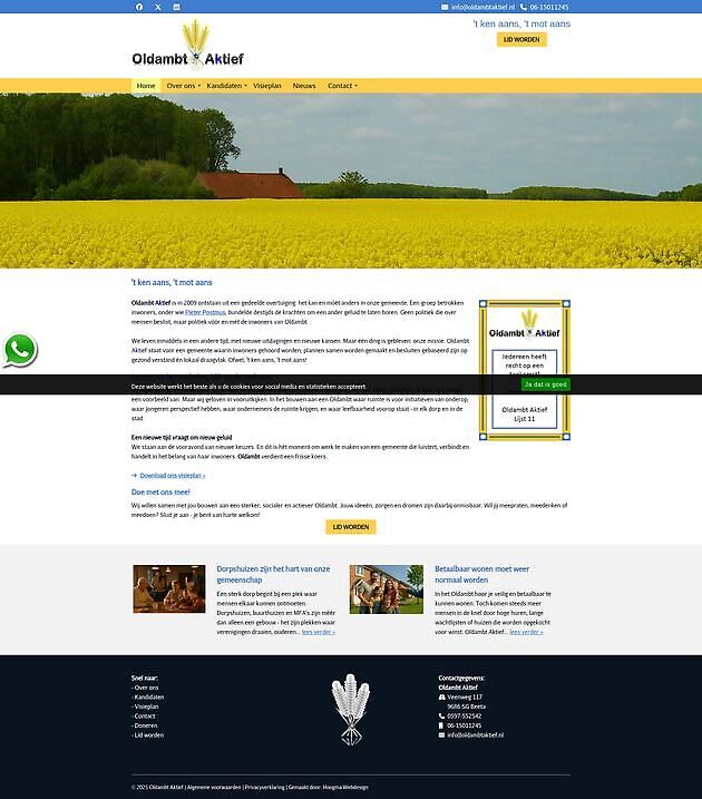
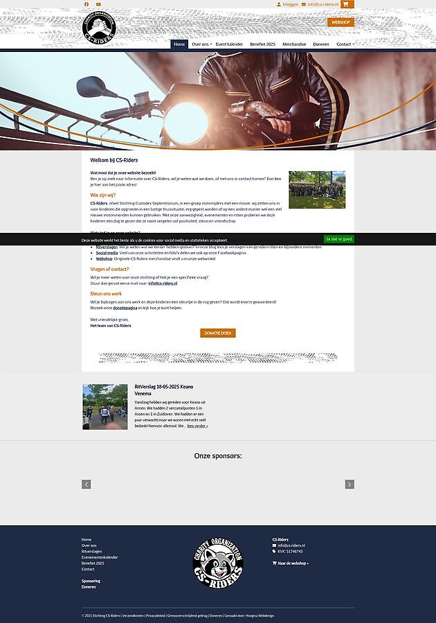
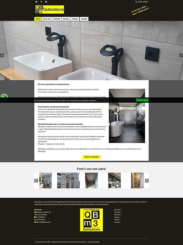
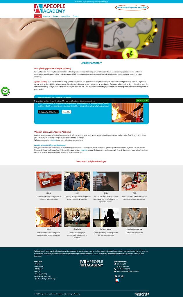
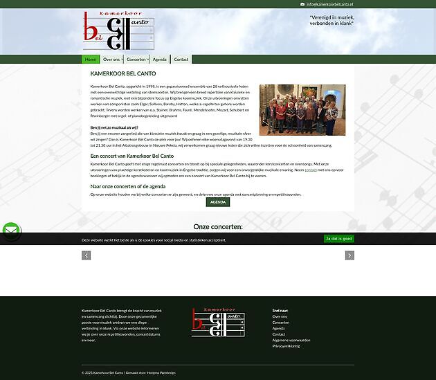
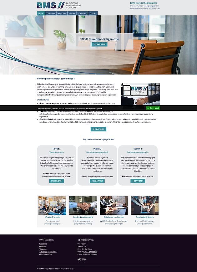
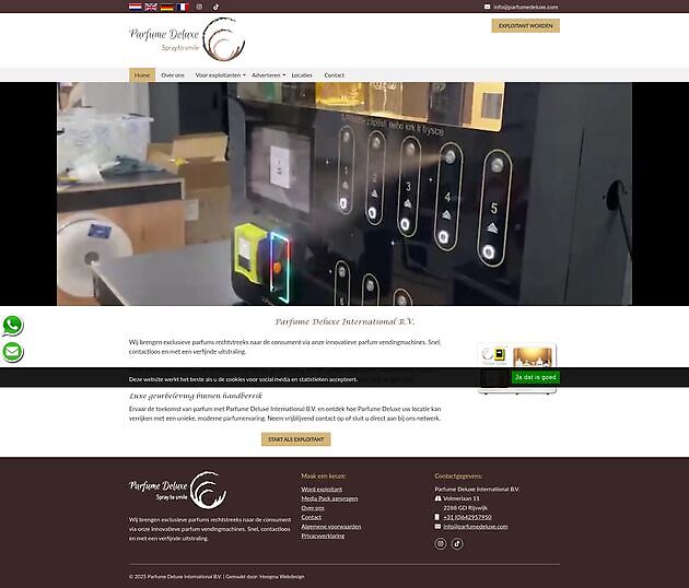
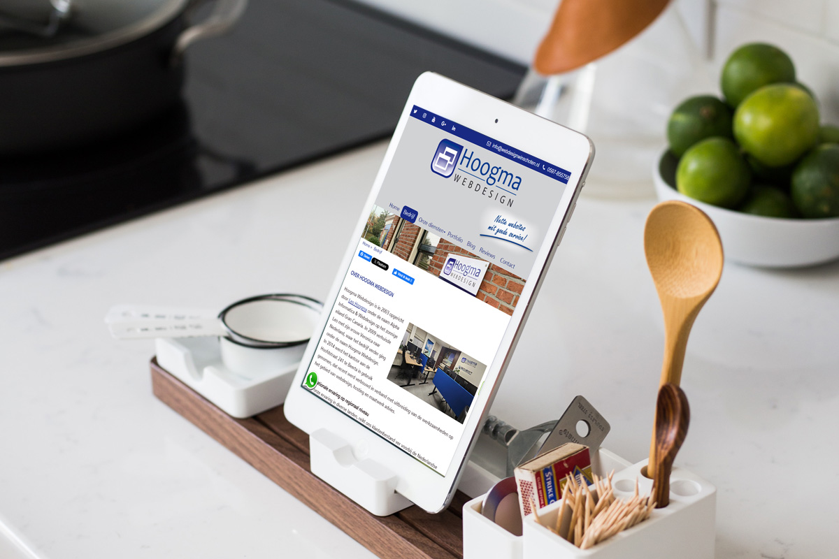
You can leave the building of a well-functioning responsive website to Hoogma Webdesign. The website is extensively tested on various devices. Don't miss out on customers because your website doesn't work mobile! Today you need to contact us for the mobile opportunities for your website bespreken.
Would you like to see more? Go to the page Our services.
Schrijf in je voor onze nieuwsbrief:


Attention! A new type of scam via iDeal is circulating. With the transition from iDeal to Wero (the new European payment system), criminals are trying to steal your data or money. Hoogma Webdesign,... read more »

Maybe it feels like your website is still pretty up-to-date. It just works, doesn't it? But online years count differently: a website that is 10, 11 or 12 years old is really old in internetland.... read more »